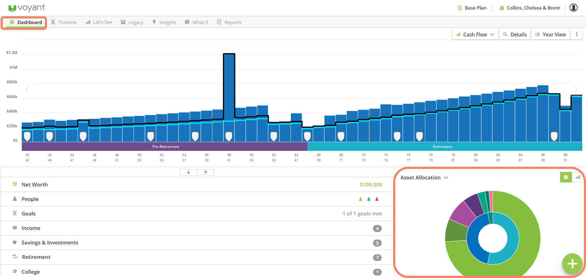
The pie chart displayed in the bottom-right corner of the Dashboard screen is a user-configurable widget. You can use a drop-down menu to set alternative views for this section of the screen, including Assets by Type and Assets versus Debts. Moreover, once you set this widget on a given computer, it will remain conveniently set as such until you choose an alternative widget for display in this section of the Dashboard.
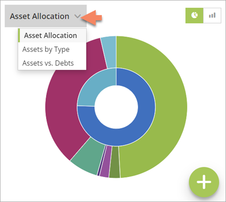
In addition to the software's default Asset Allocation pie chart, you can click the drop-down menu to choose two alternative overviews for display in this section of the screen.
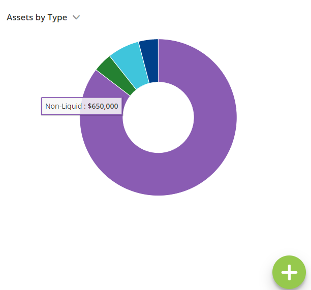
An Assets by Type overview is available. This overview presents a first-year, start of plan view of the simple Assets chart in a pie chart format.
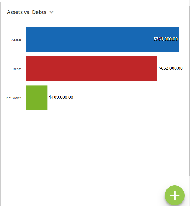
A start of plan Assets versus Debts overview is another option for this section of the screen.
An option to display an alternative overview in this corner of the Dashboard has been a common request from advisers who don’t choose to set their investments to be grown using asset allocations.
Users may choose instead to set accounts to be grown using fixed growth rates, in which case the pie chart usually shows the software’s default asset allocation of 100% Cash. Showing a 100% Cash asset allocation can be misleading for clients who in reality have their assets invested in a variety of different types of assets, only the adviser is choosing not to specify these when setting up the plan in Voyant.
This widget section of the of the Dashboard will continue to display initially an interactive pie chart consisting of an outer ring, indicating the blended asset allocation for all the accounts in the plan that are set to be grown using an asset allocation.
Move your cursor over any section of the outer ring and a total of the assets invested in the selected asset category, as of the plan’s start, will be displayed.
The inner ring, which is also interactive, shows totals of invested assets by general categories, such as pensions or savings and investments, omitting illiquid assets, such as properties. These asset categories may vary depending on country.
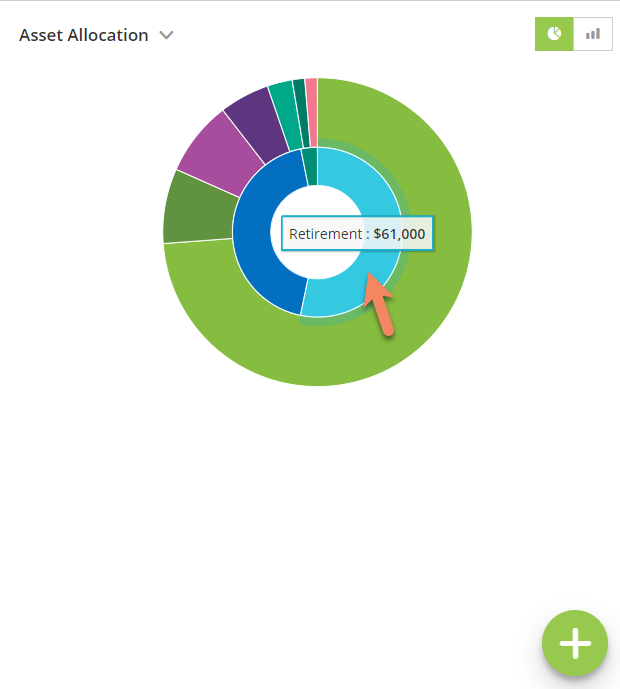
A button to the top-right of the pie chart allows you to switch from a pie chart to a bar chart of the blended asset allocation, across all invested assets set to be grown using asset allocation, by percentage.
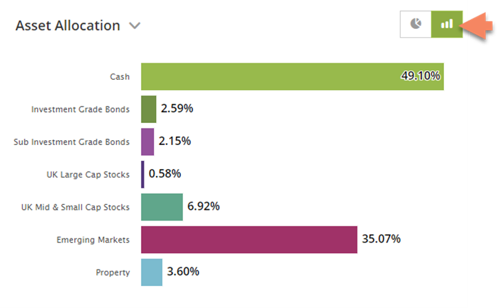
This pie chart with bar chart toggle remains the software’s initial default for this section of the Dashboard. However, once you choose an alternative view for this section of the screen -- either Assets by Type and Assets versus Debts -- it will remain conveniently set as such on the computer at least until you choose an alternative widget for display in this section of the Dashboard.