Introducing the Dashboard
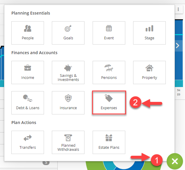
The Dashboard is the screen on which you will do the bulk of your work as you build client cases. It has everything you will need to set up, build, and review your plans. The Dashboard offers a combination of build, results, and overview, all on one convenient screen.
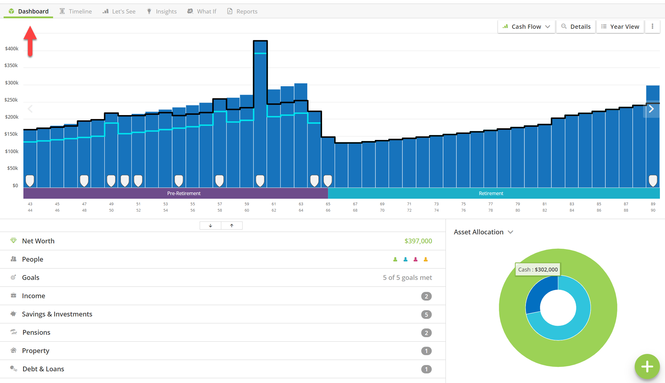
Adding information to your plan
Data entry options are all accessed from the plus (+) menu bottom right. To add new information about your clients, always click the plus (+) button on the Dashboard.
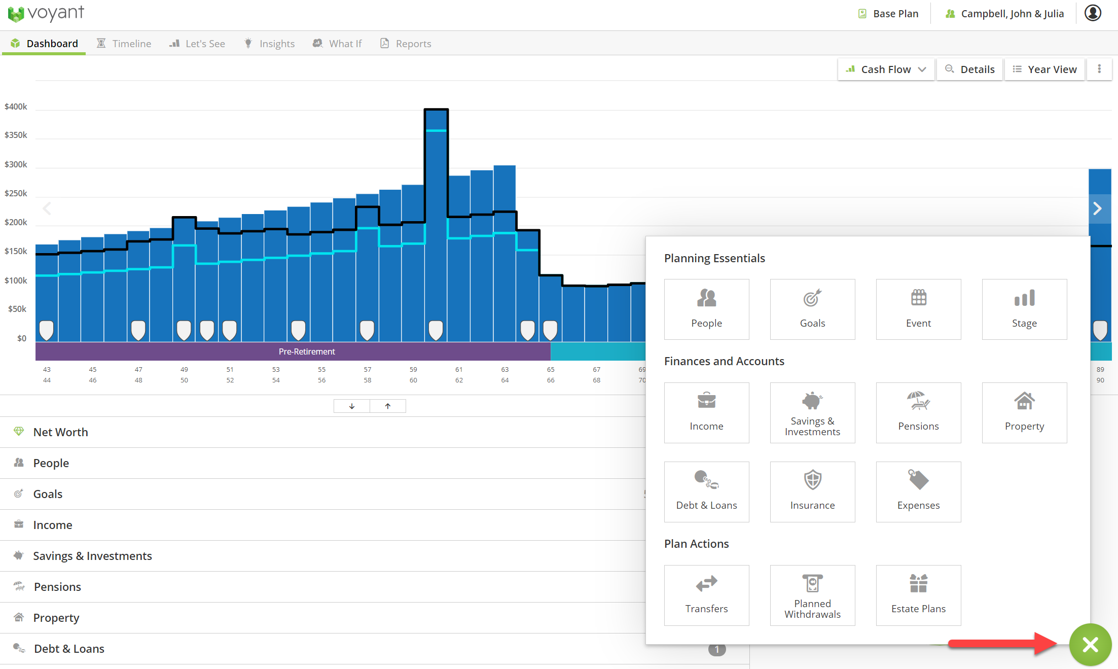
View the plan as you build it on the Dashboard
The Dashboard will also show the plan’s results in the charts at the top of the screen.
The charts section of the Dashboard will be blank initially, at least until you begin entering your client’s incomes, assets, debts, and expenses into the plan. Once you begin entering this information, the charts will show the plan’s results as you build it.
The Cash Flow chart, the chart shown initially on the Dashboard once you’ve entered earnings or other incomes, consists of blue bars with each bar representing a future year in the plan. These blue bars represent incomings.
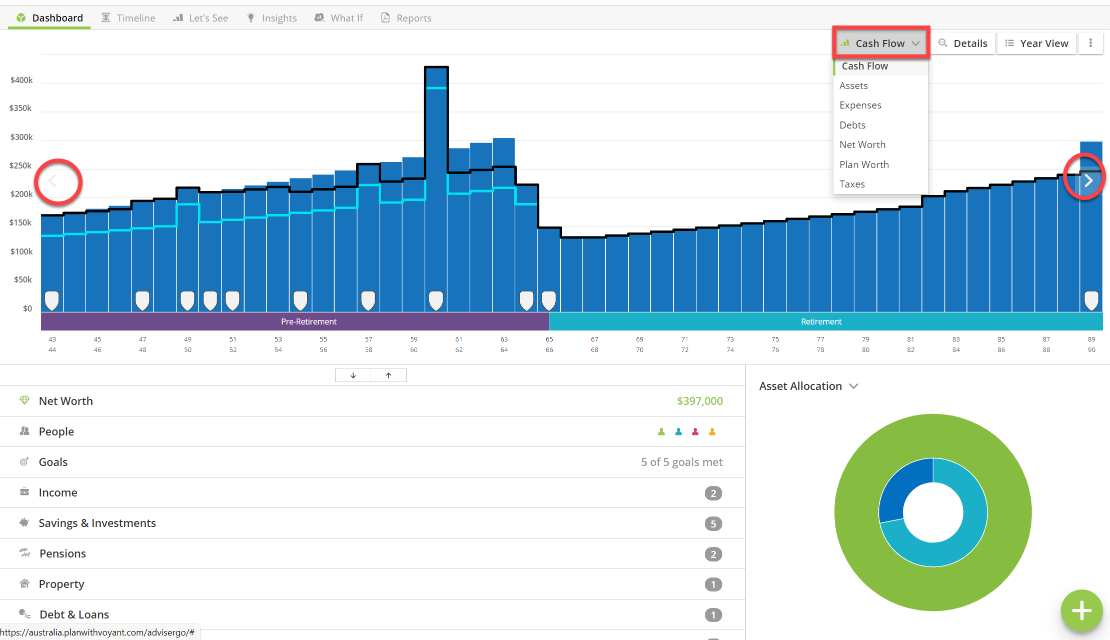
How to switch between charts
Use the drop-down chart selection menu top-right, the arrow buttons to the left and right of the chart, or if you are using AdviserGo on a device with a touch screen, such as a tablet, swipe left or right on the chart to change between them.
The Dashboard presents an overview of everything in the plan, perfect for reviews
An overview of everything entered in the plan will be shown in bottom half of the screen in a series of expandable categories. This is where you will go to later whenever you need to select an item to view, edit or delete from a plan. The up/down arrows at the top of this overview section of the screen will allow you to quickly expand or collapse all categories of information.
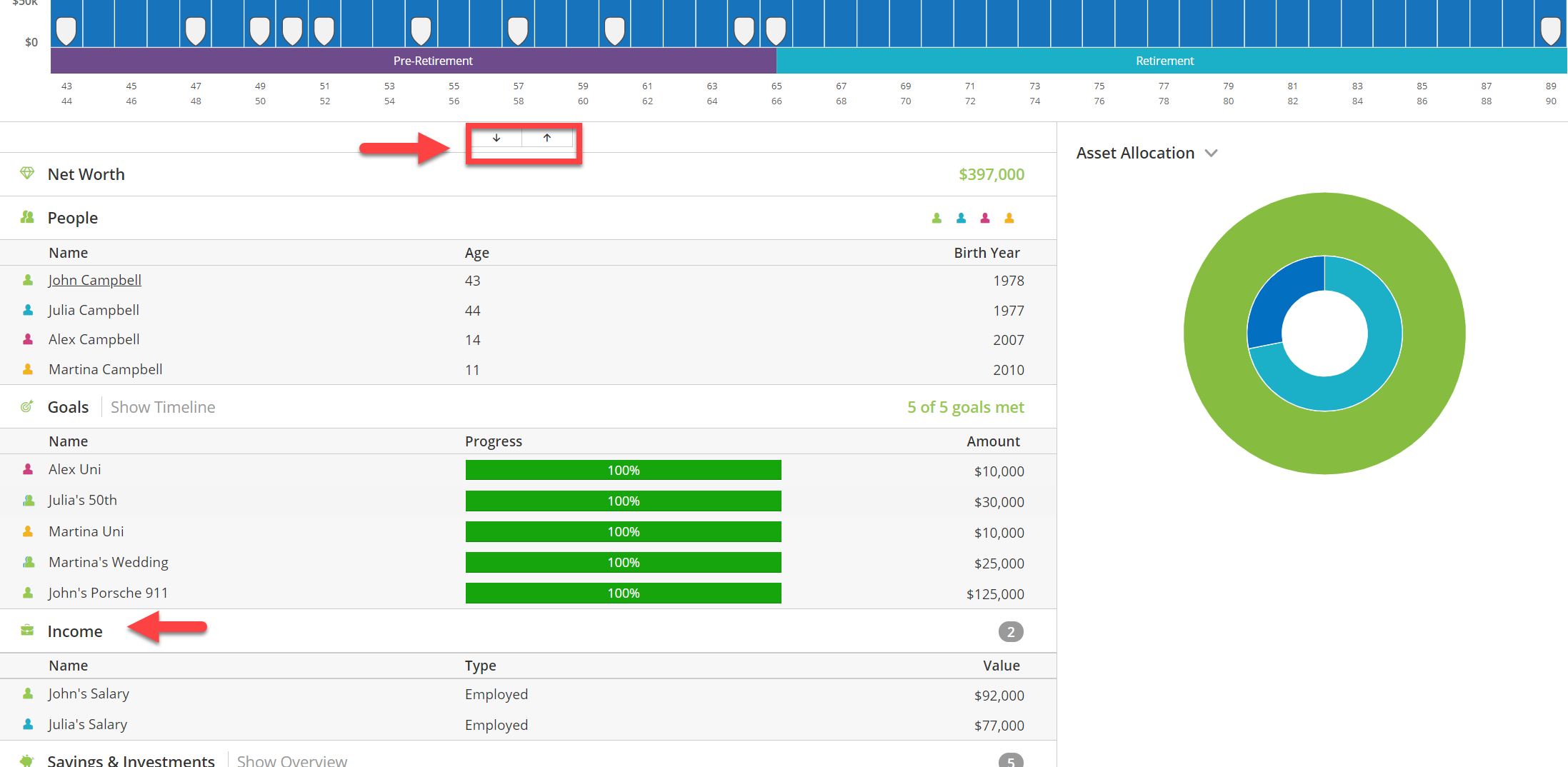
Your client’s goals (future expenditures that you have entered as goals, not expenses), together with progress bars indicating their likelihood of achieving them, will be shown higher up the overview where they are given more prominence.
Colour coding
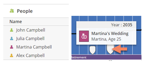
As you enter basic personal details about the people in the plan, notice how each person is assigned a colour. This randomly assigned colour coding will appear throughout AdviserGo and in reports to show which person is connected to certain events and goals.
For example, the event marking Martina’s future wedding would in this case be displayed in magenta. Colour coding is also used to indicate the ownership of investments, incomes and other items in the plan on the Dashboard.
View the numbers behind the charts, access the Year View
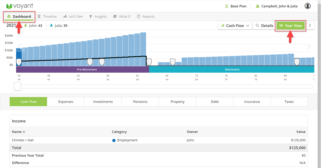
To view the numbers behind the charts, either double click any bar of the chart (if you are using tablet, long press the bar) or click the Year View button top right.
The chart details will be shown, as pictured below. If you accessed the chart details by double-clicking a bar of the chart, the details for the year you selected will be shown initially. Otherwise, select a year using the slider bar or by clicking the appropriate bar/year of the chart above the details.
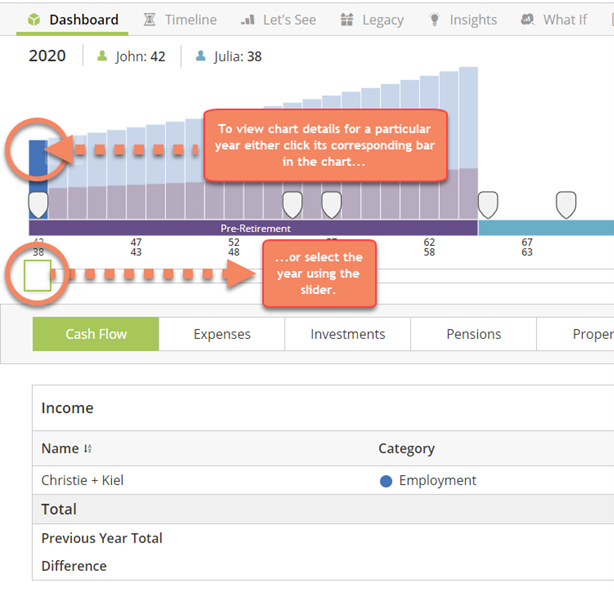
You can easily navigate from year to year in the chart details using slider bar above, by clicking the bars of the chart, or using the previous year/next year arrow buttons below the details panel.
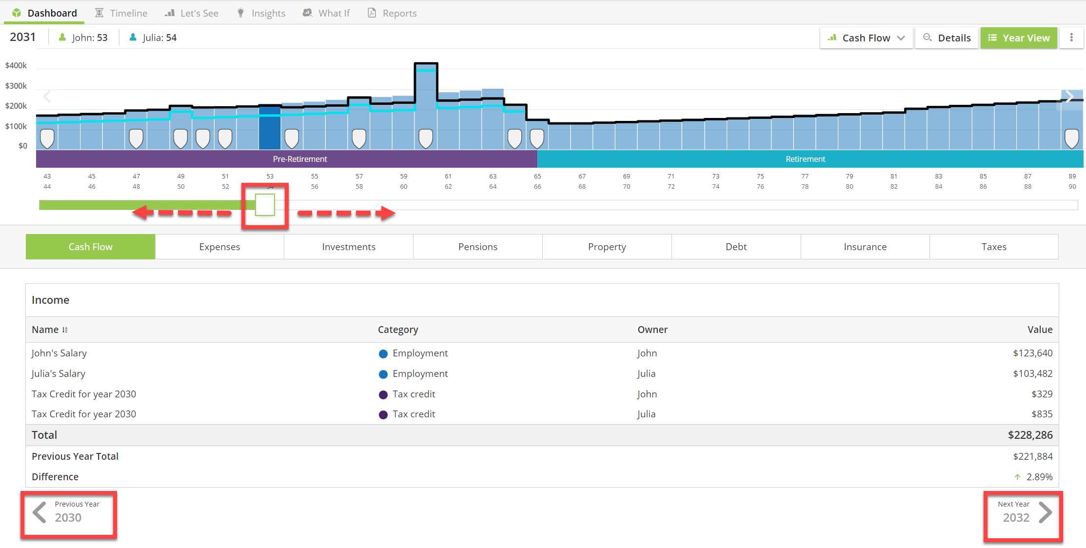
The chart details allow you to easily access to all the annual transactions and calculation details behind the charts, which are arranged by category into the following tabs.

Cash Flow – Income, other payments, withdrawals from assets.
Expenses – Scheduled expenses, taxes and contributions to savings, investments, and pensions.
Investments – Account balances, growth rates, contributions and withdrawals from investments and saving.
Pensions – Contributions, final salaries, and age pension benefits.
Properties – Property values, outstanding balances on any associated debts (mortgages), owner equity and ultimately revenue once the property is liquidated.
Debts – End of year balances and annual payments on debts, lines of credit and equity release plans.
Protection – Benefits and policy premiums.
Taxes – A worksheet detailing how AdviserGo arrives at its annual tax calculations for each person in the plan. This tab also incudes cumulative tax totals by type of tax. These totals are up to the selected year of the plan.
To leave the chart details and return to the Dashboard, simply toggle off the Year View button (top-right) or click Dashboard, top-left.
Configuring Your Plan - Plan Settings and Carryover Assumptions
At the bottom of the Dashboard are two important, general categories of settings, which control many of the software’s future calculations – the Carryover Assumptions and the Plan Settings.
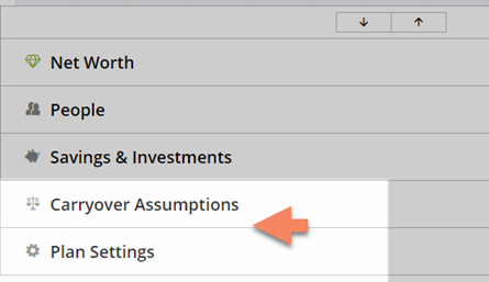
Carryover Assumptions - Client-specific information on taxes and contributions that predate the start of the plan
You will find on the Carryover Assumptions screen all manner of client-specific assumptions that predate the beginning of the plan. This is where to enter information specific to individuals within the plan that the software could not otherwise ascertain. Every person in the plan will has their own set of carryover assumptions.
A standard carryover assumption is your client’s Resident Type. This setting is used to determine tax jurisdiction, primarily to capture the differences in the tax rates and bands for Permanent Residents and Foreign Nationals. This setting is initially assumed to be the same for everyone in the family but could be changed for individuals here on the Carryover Assumptions screen.
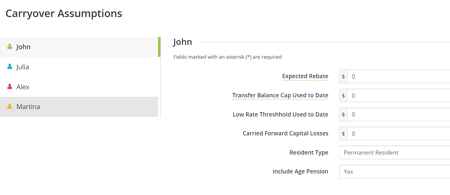
Carryover Assumptions include capital losses carried over from prior the plan’s start and tax rebates due from the year prior to the plan’s start.
Plan Settings - Set the software's default assumptions
Plan Settings, is the bottommost link on the Dashboard. It is in the Plan Settings that you can view and edit the software’s default assumptions about things such as the growth rates for savings and investments, inflation rate, the future growth of earnings (National Average Earnings) and property growth rates (Property Growth/Depreciation Rate). Furthermore, the Default Tax Table Assumption determines the rate at which the tax bands increase beyond the known.

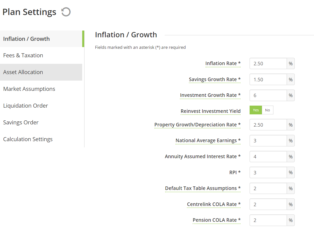
About the default Plan Settings
It is quite likely that some of the software’s initial default assumptions will differ from the position you would choose to take. Voyant is not a data provider. In fact, other than its tax calculations and coded rules for pensions and products, the software is designed to be data agnostic. You might think of these default assumptions merely as placeholders to get you started with the software.
We encourage you and your firm to review and update these assumptions to values that you consider reasonable and justifiable. The Plan Settings are a good place to begin as you start using Voyant as these assumptions will act as the foundation for your plans.
Plan Settings define the software’s default assumptions
Although preferences provide the defaults, many of these settings, including growth and inflation rates, can still be modified for items individually, within the plan.
Expenses, for example, are grown using a default Inflation Rate, which is taken initially from the Plan Preferences.
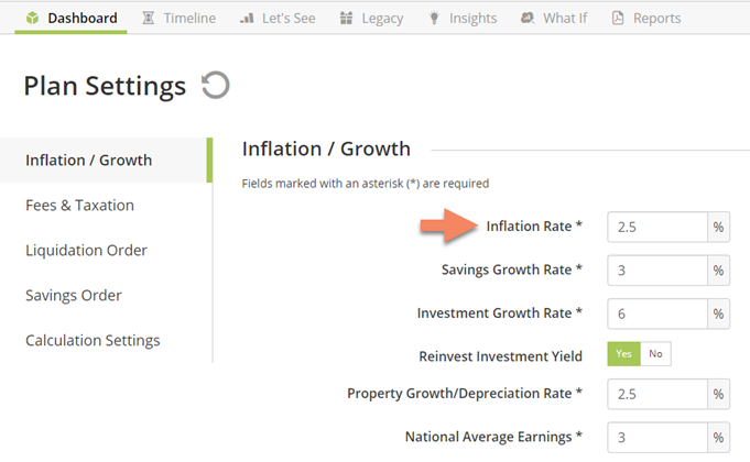
If an individual expense needs to be inflated at a rate higher or lower than this general default, then simply change this Inflation Rate setting as you enter or edit the expense. Once edited at the item level, the default inflation rate will be overwritten for that expense and will remain so, even if you were to change the overall default inflation rate for the plan.
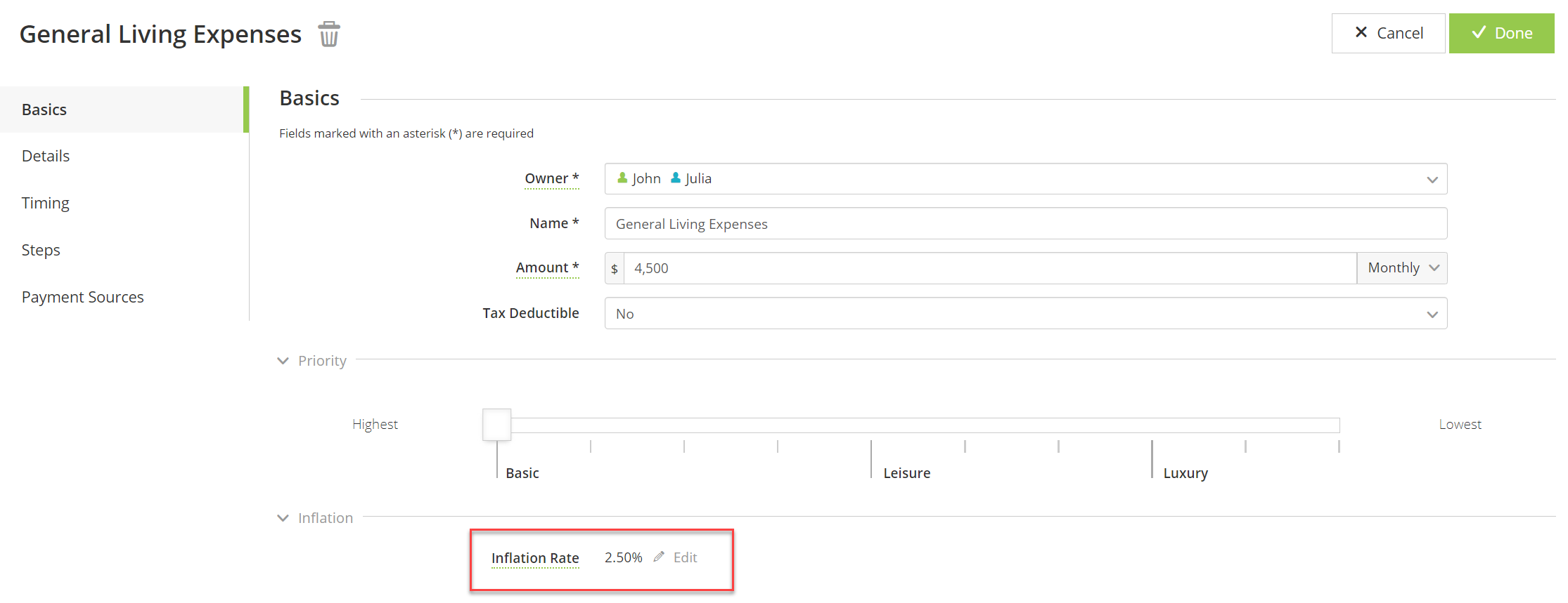
You can, however, easily revert the expense back to the default Inflation Rate, as it is set in the Plan Settings, by clicking the Use Defaults button to the right of the Inflation Rate, as shown below.

The asset allocation, asset overview widget
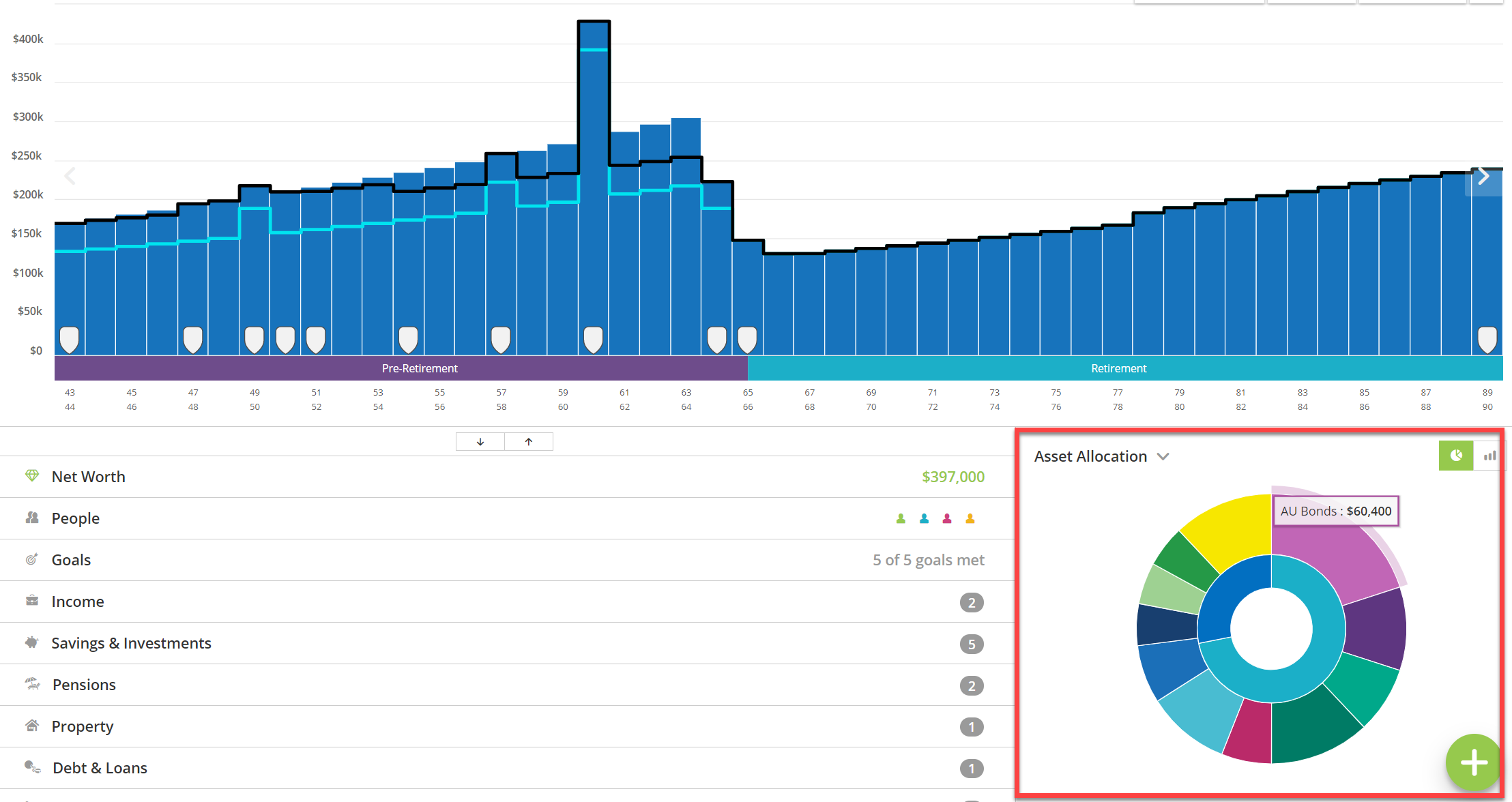
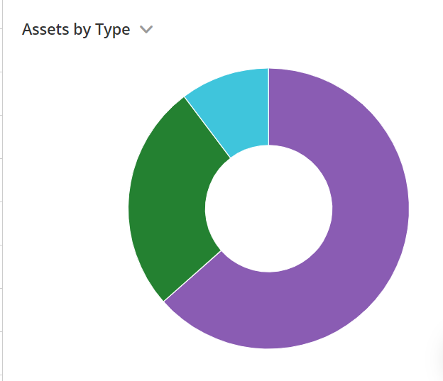
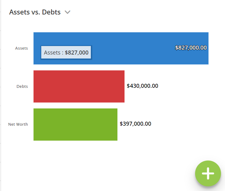
The pie chart displayed in the bottom-right corner of the Dashboard screen is a user-configurable widget. You can use a drop-down menu to set alternative views for this section of the screen, including Assets by Type and Assets versus Debts. Moreover, once you set this widget on a given computer, it will remain conveniently set as such until you choose an alternative widget for display in this section of the Dashboard.
In addition to the software's default Asset Allocation pie chart, you can click the drop-down menu to choose two alternative overviews for display in this section of the screen.
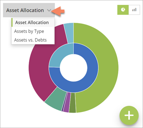
The Assets by Type overview presents a first-year, start of plan view of the simple Assets chart in a pie chart format.
A start of plan Assets versus Debts overview is another option for this section of the screen.
An option to display an alternative overview in this corner of the Dashboard is a common request from advisers who don’t choose to set their investments to be grown using asset allocations.
Users may choose instead to set accounts to be grown using fixed growth rates, in which case the pie chart usually shows the software’s default asset allocation of 100% Cash. Showing a 100% Cash asset allocation can be misleading for clients who in reality have their assets invested in a variety of different types of assets, only the adviser is choosing not to specify these when setting up the plan in AdviserGo.
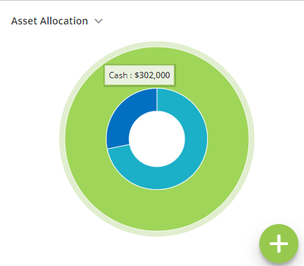
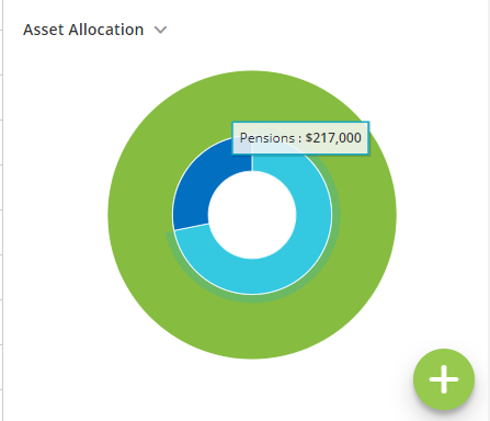
This widget section of the of the Dashboard will continue to display initially an interactive pie chart consisting of an outer ring, indicating the blended asset allocation for all the accounts in the plan that are set to be grown using an asset allocation.
Move your cursor over any section of the outer ring and a total of the assets invested in the selected asset category, as of the plan’s start, will be displayed.
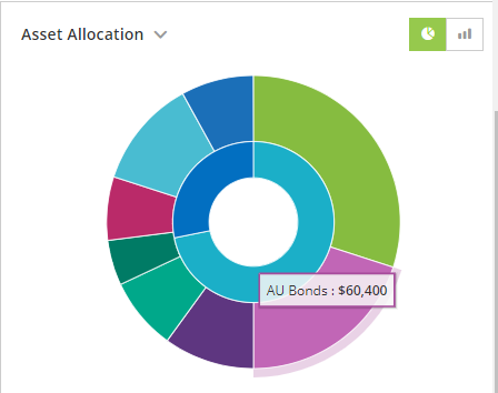
The inner ring, which is also interactive, shows totals of invested assets by general categories, such as pensions or savings and investments, omitting illiquid assets, such as properties. These asset categories may vary depending on country.
A button to the top-right of the pie chart allows you to switch from a pie chart to a bar chart of the blended asset allocation, across all invested assets set to be grown using asset allocation, by percentage.
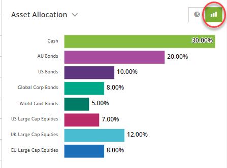
This pie chart with bar chart toggle remains the software’s initial default for this section of the Dashboard. However, once you choose an alternative view for this section of the screen -- either Assets by Type and Assets versus Debts -- it will remain conveniently set as such on the computer at least until you choose an alternative widget for display in this section of the Dashboard.